
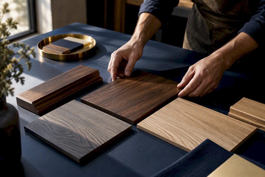
Yes, mixing wood tones works when you follow three rules: choose a dominant "field" wood to anchor the room, match undertones rather than chasing identical shades, and repeat each tone at least twice so the pairing reads as intentional. Two tones is the safest number, three the practical ceiling. Get those fundamentals right and a mixed-wood scheme feels curated rather than accidental.
TL;DR:
- Matching undertones is more important than lightness when pairing woods, so always compare samples in natural daylight to ensure warm or cool tones align.
- Repeating each wood tone at least twice in different locations creates a cohesive and intentional mixed-wood scheme, with two tones being the safest maximum.
- Choosing a dominant field wood before buying furniture or finishes helps prevent a disjointed look and guides all subsequent design decisions.
- Contrasting grain, finish sheen, and texture add depth to the room, with deliberate variation helping avoid a flat or mismatched appearance.
- Commissioning bespoke finishes allows for precise matching when existing wood and ambiance make standard options inadequate.
Table of Contents
- 1. Choose a dominant wood tone before anything else
- 2. Does the wood have a warm or cool undertone?
- 3. How many tones to use and where to repeat them
- 4. Use contrast, grain and texture to build depth
- 5. Common mistakes and how to fix them without a full redo
- 6. Specifying finishes and bespoke options: guidance from a maker
- 7. How matt and gloss finishes change the way tones read
- 8. Bringing metal, stone and fabric into the wood palette
- 9. Why daylight and artificial light change wood tones
- 10. Working painted or stained wood into a natural palette
- 2026 trend note: warm minimalism and material honesty
- How a bespoke maker can help with matched wood tones
- Sources
- FAQ
1. Choose a dominant wood tone before anything else
Every well-composed room has a field wood, the tone that dominates the largest surfaces such as flooring, kitchen cabinetry or panelling. This is the wood your eye settles on first, and it sets the temperature for every other timber you introduce afterwards. According to Studio SVI's guidance on mixing wood tones, pairing succeeds when you identify a dominant tone first and treat everything else as a complementary accent rather than an equal partner.
Choosing the field wood before you buy a single chair or shelf saves you from a room that feels like a showroom of unrelated samples. Practical steps worth following:
- Hold full-size samples, not swatches, in the room at different times of day.
- Check how each option wears against existing textiles, worktops and stone.
- Favour the wood already fixed in place, such as flooring, since it is the hardest and most expensive element to change.
Once the field wood is settled, every later decision (rugs, furniture, accent shelving) becomes a question of what answers to it, not what competes with it. Our wood species selection guide covers durability and grain characteristics worth weighing at this stage.
2. Does the wood have a warm or cool undertone?
Undertone, not lightness, is what makes two woods sit comfortably together or clash. A pale ash and a mid-toned oak can pair beautifully if both lean warm, while a honey oak and a grey-washed walnut will fight each other even though their values are similar. LUXOM's rules for mixing wood tones make the point directly: undertone matters more than value, so pair woods that share warm or cool undertones even when their lightness differs.
The simplest test takes minutes:
- Place both samples together in the same natural daylight, ideally near the window they will eventually sit beside.
- Look past the overall colour and ask whether each sample leans towards red or yellow (warm) or grey or pink (cool).
- Reject any pairing that mixes warm and cool undertones, regardless of how close their shades appear under artificial light.
Studio SVI recommends this same in-situ daylight comparison before committing to a purchase, since showroom lighting routinely flatters mismatches that daylight exposes.
3. How many tones to use and where to repeat them
Restraint is what separates a considered scheme from a cluttered one. Two tones is the safest number and three is the practical ceiling, according to LUXOM's guidance on mixing wood tones, and each tone should reappear elsewhere in the room to feel deliberate rather than incidental.
- Repeat your field wood in at least two locations, such as flooring and a dining table.
- Introduce a second tone through furniture and repeat it once more, perhaps in a picture frame or shelf bracket.
- Reserve a third tone, if you use one at all, for a single small accent such as a stool or a tray, never a large surface.
In an open-plan space, this might mean oak flooring running throughout, walnut in the kitchen island and dining table, and a smaller ash or reclaimed pine piece appearing twice as a side table and a set of shelf brackets.
4. Use contrast, grain and texture to build depth
Once your tones and undertones are settled, contrast is the tool that stops the palette feeling flat. Choose your pairings by value, pale against mid-tone, or mid-tone against deep, so the difference reads as a design choice rather than a near-miss match. Studio SVI frames this balance of value, undertone and grain as the core of a successful scheme.
Grain and finish do further work here. A smooth, tight-grained ash next to a heavily figured walnut creates tactile interest even where the tones are close, and varying sheen (matt against satin, for instance) adds another layer without introducing a third colour.
- Pair one smooth-grained wood with one more figured or knotty species for contrast.
- Vary finish sheen between pieces rather than colour alone.
- Coordinate metal and stone accents so they echo the warmth or coolness of your chosen woods.
Brushed brass and warm bronze hardware tend to sit comfortably with warm-toned woods, while satin nickel or chrome suit cooler palettes. Our furniture finish types guide has more detail on matt, satin and gloss pairings by room.
Pro Tip: Lay your metal hardware samples directly on the wood swatch in daylight before ordering, since undertone clashes between wood and metal are just as jarring as clashes between two woods.
5. Common mistakes and how to fix them without a full redo
The most frequent misstep is mixing undertones rather than mixing tones, a warm honey oak beside a cool grey-washed walnut is the classic culprit. The second is choosing a tone and never repeating it, so one lone piece of ash or teak looks stranded and forgotten rather than part of a scheme.
- Sign: two woods look "off" together even though their colours seem close. Fix: check undertones again in daylight and swap one piece if they conflict.
- Sign: a single wood tone appears only once in the room. Fix: repeat it in a smaller accessory, such as a tray, frame or stool.
- Sign: the whole scheme feels heavy or busy. Fix: introduce a bridging neutral, a rug, painted panel or stone surface, to give the eye somewhere to rest.
If a mismatch only shows up once furniture is delivered, resist buying a fourth wood to compensate. Our oak versus walnut comparison is a useful reference before you commit to a pairing, and it is often cheaper to delay a purchase and sample further than to correct a clash after the fact.
6. Specifying finishes and bespoke options: guidance from a maker
Some undertone problems cannot be solved by buying differently, they need a finish made to match. When an existing floor or fitted piece sits at an awkward angle between warm and cool, commissioning a bespoke finish or a matched panel is often the more reliable route than continuing to shop off the shelf.
A skilled finisher approaches this by mixing stain samples against your actual timber, in your actual light, rather than working from a swatch book alone. That is the same discipline behind our own process: every piece we make is finished to order, so a client can request a sample panel matched to an existing floor or cabinet before committing to a full piece.
- Ask for an in-situ sample panel finished in your own room, not a generic swatch.
- Request a mock-up on the same wood species you already own, since stain reads differently across species.
- Confirm undertone in writing (warm or cool) before the finish is applied to the full piece.
A finish is only ever as good as the light it is tested in, and the room it is tested in, is the only light that matters.
Our guide to custom finish options walks through this specification process step by step.
7. How matt and gloss finishes change the way tones read
Sheen affects perceived colour as much as the tone itself. A gloss finish reflects more light and can make a wood appear lighter and cooler than the same species in matt, while a matt or oiled finish absorbs light and deepens the apparent warmth of the grain. Two pieces cut from the same timber can look like different woods entirely once one is lacquered to a high shine and the other left in a raw, oiled state.
This matters most where you are trying to repeat a tone across a room. A matt oak floor and a glossy oak table may share a species but read as mismatched because the sheen difference exaggerates any small variation in undertone. Keeping sheen consistent across repeated instances of the same wood, or deliberately varying it as a texture choice rather than an accident, is worth deciding upfront.
As a general guide, matt and satin finishes suit warmer, more relaxed palettes, while higher-gloss lacquers tend to suit cooler, more formal schemes where crispness is the goal. Mixing sheen levels within a single tone is a legitimate way to add texture, provided it is a deliberate contrast rather than an inconsistency between pieces bought at different times. Our finish types guide sets out which sheen suits which location, from hallway floors to dining tables.
8. Bringing metal, stone and fabric into the wood palette
Wood rarely stands alone in a finished room, and the other materials around it either reinforce your palette or undermine it. Metal hardware, stone worktops and upholstery fabric all carry their own undertones, and the same warm-versus-cool logic that governs your woods applies to them too.
Brushed brass and warm bronze read as warm and sit naturally alongside honey oak or walnut, while satin nickel and chrome lean cool and suit ashier, greyer timbers. Stone worktops in warm cream or beige tones support a warm wood scheme, whereas cooler greys and whites suit a cooler palette. Fabric works the same way: a rust or ochre upholstery reinforces warm wood, while a blue-grey or charcoal textile suits cooler tones.
The safest approach is to treat your dominant wood as the reference point and test every other material against it in the same daylight you used for the wood samples themselves. Layering natural materials together, wood, leather, woven textile, supports a mixed-wood scheme and gives a room a collected, lived-in feel rather than a matched, showroom look, a point echoed in Fowler Brothers' notes on warm wood and earthy colour palettes. If you are choosing window glazing or frames as part of the same renovation, it is worth knowing that different glazing types shift how daylight reaches your samples, something covered in this window style guide.

9. Why daylight and artificial light change wood tones
Light temperature alters how a wood tone reads more than almost any other variable, which is why samples that looked perfect in the shop can look wrong at home. Cool, north-facing daylight can make a warm oak look flatter and greyer than it will under the golden light of a south-facing room, and warm artificial bulbs can push a cool ash towards yellow.
This is why every source on mixing wood tones insists on testing samples together, in the room, in the light they will actually live in. LUXOM's rules for mixing wood tones and Studio SVI's guide both treat this as a non-negotiable step rather than a nicety, and it is the single most common reason a considered pairing fails once furniture is delivered.
Warmer LED or halogen fixtures tend to flatter warm-toned woods and can make a cool-toned piece look muddy, while cooler daylight-balanced bulbs do the reverse. If your room relies heavily on artificial light in the evening, test your wood samples under the bulbs you actually own, not just in daylight, since the two can tell very different stories. This guide to lighting choices is a useful reference when you are choosing fixtures alongside a wood palette, since the two decisions are more connected than they first appear.

10. Working painted or stained wood into a natural palette
Painted and stained wood can sit comfortably alongside natural-finish pieces, provided you treat them with the same undertone discipline as any other timber. A stained wood is only as convincing as the undertone it carries, and a poor stain match is often more jarring than an honest contrast between two different species.
There is a genuine caveat worth knowing here. Wood & Pilcher's 2026 trends piece warns that natural hardwoods show a depth and shifting chroma that stains applied to softer woods often fail to replicate, so a piece labelled as oak or walnut but stained onto pine can look noticeably flatter beside the real thing. Where possible, keep at least one authentic natural-finish focal piece in the room, such as a solid oak table, and let stained or painted secondary pieces support it rather than attempt to impersonate it.
Painted wood works best treated as a neutral rather than a wood tone at all: a soft sage, off-white or charcoal cabinet can bridge two natural wood tones that would otherwise sit awkwardly together, functioning much like the bridging neutral mentioned earlier for correcting a clash. If you want to reproduce an existing stain match yourself rather than commission it, our stain matching workflow sets out the process step by step.
2026 trend note: warm minimalism and material honesty
Warmer, layered wood palettes are the defining move in interiors for 2026, part of what design commentators are calling warm minimalism and organic modernism. The shift favours honest materials and visible grain over uniform, factory-matched surfaces, which is exactly what a well-considered mixed-wood scheme delivers. Small moves, a woven textile here, a warmer bulb there, do more for a lived-in, high-quality feel than chasing the next fashionable species.
— Luke
How a bespoke maker can help with matched wood tones
Getting a mixed-wood scheme right sometimes means the perfect stock piece simply does not exist, and that is precisely the gap bespoke commissioning closes. At Simmons Interior Supply, every piece in our bespoke furniture collection is handcrafted to order, so a finish can be matched to your exact field wood rather than approximated from a standard range, and a design can be repeated across a room in the correct scale.

If you have a tricky pairing to solve, a piece like our bespoke nest of coffee tables shows how size and finish can be tailored together. We're always happy to work from a sample panel or an existing swatch, so start with a brief and we will take it from there.
Sources
- Three Rules for Mixing Wood Tones Without Getting It Wrong — LUXOM Journal | LUXOM Developments
- 2026 interior design trends — The evolution of refined tactility and the new standard, Yoguri | TOPPAN Inc.
- How To Mix Wood Tones | A Modern Guide - Studio SVI
- 2026 interior design trends (Wood & Pilcher blog)
FAQ
Can I mix different wood tones in one room?
Yes, mixing wood tones is a standard design approach when you pick one dominant tone, match undertones, and repeat each tone at least twice in the space. Two tones is the safest number to work with and three is the practical ceiling for most rooms, according to LUXOM's guidance on mixing wood tones.
What wood tones look good together?
Woods that share the same undertone, both warm or both cool, tend to pair well even when their overall lightness differs, since undertone matters more than value. A warm honey oak with a warm walnut, or a cool ash with a cool grey-washed timber, are both reliable starting points according to Studio SVI's pairing advice.
Can walnut and oak be mixed successfully?
Walnut and oak can work well together provided their undertones align, oak tends to lean warm while walnut can lean either warm or cooler depending on the stain, so checking both samples in the same daylight before buying is worth doing. Repeating each species at least twice in the room, rather than using one as a single accent, helps the pairing read as deliberate.
What wood tones are trending for 2026?
Warmer, layered wood palettes are the dominant direction for 2026, part of a broader move towards warm minimalism and organic modernism that favours visible grain and material honesty over uniform, factory-matched finishes. Engineered woodgrains that bridge natural and manufactured looks are also gaining ground as a way to introduce a neutral tone between two natural woods.